 |
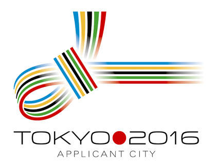
I’m not sure what I think about this logo, but it’s a knot that’s traditionally used to tie gifts. The colors used — red, blue, green, black and yellow — are the Olympic colors represented by the rings.
Tokyo’s the latest bid nation to create a logo. JOC President Tsunekazu Takeda and Tokyo Gov. Shintaro Ishihara both submitted letters of intent last month.
Personally, I think the original Chicago 2016 logo was a bit cooler, but we’re still waiting on the new logo. At least it’s better than the jigsaw puzzle that is the London 2012 logo.